Help Choose the Town of West Hartford’s New Logo

Audio By Carbonatix
The Town of West Hartford will be adopting one of these logos, and the community is invited to vote for their favorite. Courtesy images
The Town of West Hartford is asking the community to weigh in on the final design of a new logo.
By Ronni Newton
The Town of West Hartford is looking for additional community input as the process of updating its brand and logo is finalized.
A survey was launched on Friday, Feb. 1, and the public has the opportunity to vote between two logos that have been chosen as finalists following the rebranding initiative that has been taking place since last year.
West Hartford’s official logo has been in use since 1988, and while many departments and events have created their own completely different logos in the intervening 30 years, and the goal of the project was to develop an updated, modern image that can be used for all purposes.
“As you may remember, in September, the first phase of this project was to gather words that best describe West Hartford which would serve as inspiration for the logo design. That survey resulted in 883 responses,” Public Relations Specialist Renée McCue said in a news release announcing the latest survey.
According to McCue, the following words and phrases were the top vote-getters, from among the 18 choices in September’s survey were: Top-Rated Schools, Best Place to Raise a Family, High Quality of Life, Vibrant, Diverse and Engaged Community.
West Hartford strategic marketing and public relations firm Ryan Marketing was chosen last spring to assist with the project, and created multiple logo designs based on the feedback from the community.
“West Hartford means so many different things to the people who live and work here. Our two logo finalists capture the essence of West Hartford very well,” said McCue
The following is what logo no. 1 is meant to represent:
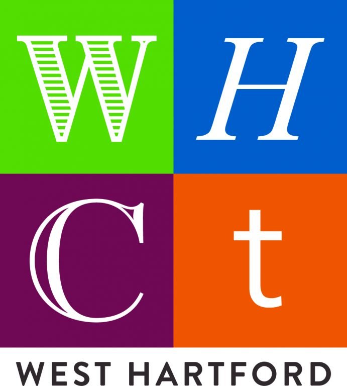
Town of West Hartford logo option no. 1. Courtesy image
“The block logo design with the four different fonts and colors was inspired by the alphabet wall in Webster Walk at Blue Back Square. The logo represents the diversity of West Hartford’s offerings. The use of four very different, contrasting typefaces stacked in colored blocks for ‘WHCT’ are representative of the idea that West Hartford has anything and everything that one could look for in a town. The blue H and red C are also a nod to Hall and Conard high schools. It’s playful, yet timeless and sophisticated.”
The following is what logo no. 2 is meant to represent:
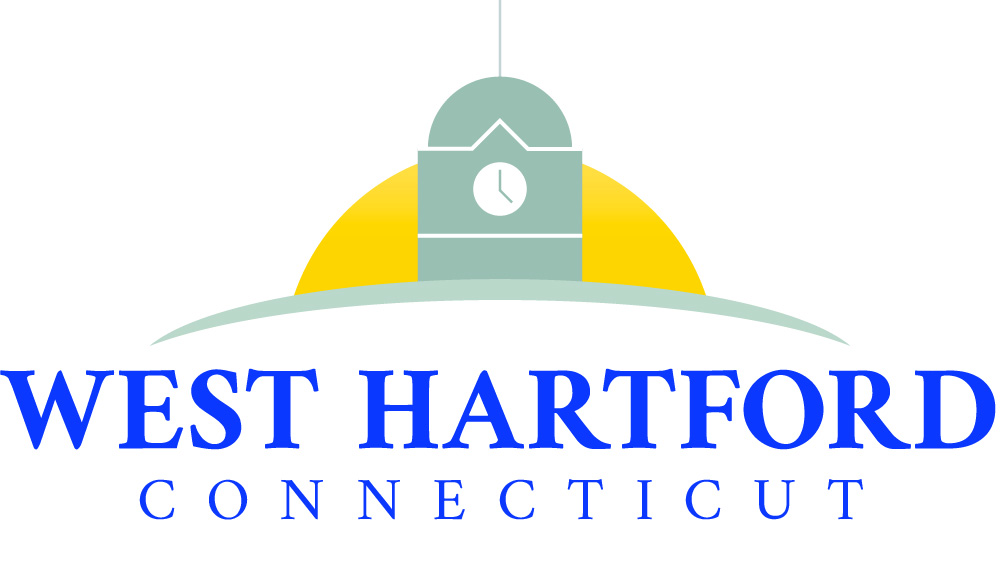
Town of West Hartford logo option no. 2. Courtesy image
“The rectangular-shaped logo was inspired by the clock tower in West Hartford Center. This logo puts a modern spin on an enduring symbol of West Hartford – the dome and clock tower of the old town hall – and pays homage to the town’s history. The half circle behind the clock tower can represent either a sunrise or a sunset, highlighting all that West Hartford offers, day and night. The curved horizon line symbolizes the connection of all areas of West Hartford.”
Click here to vote for your choice online. The survey will be available through Feb. 15, 2019: http://bit.ly/WHLogo
McCue said that the town’s 30-year-old logo was way overdue for redesign.
“From a branding perspective, every 10 years organizations should reflect on how they have changed and ask themselves, ‘Does this logo still represent who we are?’,” Lindsay Ryan Jepsen, managing partner of Ryan Marketing, said in the release.
Town Manager Matt Hart said previously that the logo needs to reflect West Hartford’s “reputation, character, and quality of life,” and be able to stand the test of time.
“It has to be able to serve multiple purposes,” Hart said. “It can’t be just ‘fun,’” he said, because it will be used for a variety of purposes including parking tickets and tax bills as well as signage.
McCue said that she looks forward to community feedback, and that the Town Council will announce the final choice.
In addition to McCue, the logo project team includes: Town Manager Matt Hart, Executive Assistant Brittany Stephenson, Town Clerk Essie Labrot, Director of Leisure Services & Social Services Helen Rubino Turco, Town Planner Todd Dumais, Economic Development Specialist Kristen Gorski, and Library Specialist Joe Cadieux. Justine Konecky, project manager, Ben Roberts, creative director and Lindsay Ryan Jepsen, managing partner of Ryan Marketing were also part of the team.
Like what you see here? Click here to subscribe to We-Ha’s newsletter so you’ll always be in the know about what’s happening in West Hartford!



Personally, I don’t like either. The left one is a bunch of letters that mean nothing to outsiders and which are just a weird combination of colored blocks and fonts. The one with the town hall reads a bit vague…could be a church. With all the talent out there, this is what we have as options?
The logo should be a huge pit in the ground — with stacks of money flying in and disgruntled residents holding up their hands like they are being held hostage by out of control taxing and spending. This logo would provide real transparency with what is going on. I actually have another idea for a logo but it might “offend”, so I’ll go with my first idea here.
What a waste of hard working towns people’s money. this is what wrong today we have talented
residents and all the art classes in our school system that should have had input in this logo the first could have been done in elementary school in 10 minutes and done a better job. get smart people. town resident and taxpayer for over 55 years
[…] to refine it,” McCue said Friday afternoon. There were hundreds of comments offered when the final choices were revealed for public input in February, but the overwhelming choice between the two logos – one in blue and gold that depicted a […]